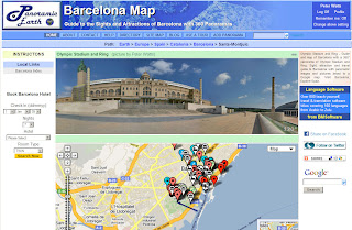
 For several months now we have been working on a major site upgrade for Panoramic Earth, completely redesigning the look, feel and functionality of the site. The good news is that the principles remain the same, still showing great 360 panoramas from around the world from panoramic photographers. Still linking the images to Google maps with local and travel information.
The better news is that the site will be easier to navigate, better to look at and have much more functionality. These two screen shots show some of the differences to be expected:
- Much cleaner feel and navigation.
- Immediate presentation of some local information without scrolling down.
- Thumbnails linking to nearby images.
- Incorporation of the Krpano flash panorama viewer giving smoother action.
- Larger, high resolution images suitable for full screen viewing.
- Ability to display both spherical and cylindrical 360 panoramas.
- Ability to embed single images as well as whole regional tours.
- Local directory for each destination covered giving local travel links.
We are very excited about these changes, offering a much better viewing experience for our visitors and expand the services we can offer the travel industry and community. 2010 will be a year of change, expansion and improvement for us.

2 comments:
Nice site. Easy navigation. Simple and creative design. Keep blogging and thanks for sharing.
Regards,
360 degree photo stitching
I saw such panormic views on many sites before. For example on AngloPolish
I must say, that i really enjoy them.
The panoramic photos can take you every where just when You are in front of the computer. It's great
Post a Comment